Front-End User Experience Design - Ryan Brown
This week I was largely focused on getting the front-end user experience up and running for our game. From main menu to game over, the goal of having a multiplayer experience complicated this process greatly. Unfortunately, I still have many problems with our menu system to solve, but the idea is at least demonstrable at this point:
To start I wanted to get the ability for players to host and join sessions together working, but without knowing of any reliable way to test this feature without going through the tedious process of sharing a fully packaged build with my teammates, I ended up relying on the less foolproof method of simply running two standalone games on my own machine. This has resulted in an issue I will need to continue to look into in the coming days, hopefully not weeks. In our test build for this week, we are still unable to connect two separate computers to a session. That said, once that problem is finally solved, much of the rest of the user experience should be already in place.

For the main menu, my layout was inspired almost wholly on Portal 2. On choosing to play singleplayer, the game starts right away, loading the user into a solo session, the same happens when choosing to host a game, but it starts the session with the host acting as a listen server. This allows for another user to choose to join a game, and brings them to another screen that allows them to search for active sessions. Once found, a widget is created and added to a scroll-able list for each active session, with a button on each widget to connect to the corresponding session. Upon choosing one, the user connects with the server as an active client, and loads into the same level to play alongside them. Other main menu buttons are also fully functional, but the options and credits buttons currently lead to work-in-progress screens.

During gameplay, players can access a pause menu at any time. This pause menu does not actually pause the game, meant to avoid disrupting the flow of gameplay in multiplayer. Resume removes the pause menu from the screen and gives back control to the player, as expected. The options button, just like on the main menu, currently leads to a work-in-progress screen. For the sake of simplicity, the next button simply says return to main menu, but in the future I may change this depending on whether the player is the host or client to say "end session" or "leave session" to more clearly communicate the behavior of this button. If the host clicks this, all players are returned to the main menu, and the session is destroyed, but if a client clicks it, the client destroys their own connection to the session and returns to the main menu alone. This does not however prevent the client from returning to the same session from join game on the main menu. This behavior was surprisingly simple to achieve by simply using Unreal Engine's "destroy session" node for a specific player controller in blueprint:

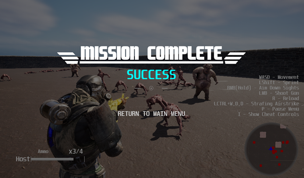
The final piece of this rudimentary UX puzzle is the game over - or "mission complete" - screen popping up when all players die or they complete their objective (currently just by defeating a certain number of enemies). Sadly, this brings another complication that has yet to be solved, as this screen only appears for the host in multiplayer at the moment, despite being designed to appear for all players. Luckily, it still shows up and correctly displays whether the players succeeded or failed their objective, and the only available button returns all players to the main menu. Eventually, this screen should allow players to individually choose whether to return to a ready-up lobby before another mission, or leave the session alone, with the host still having the ability to end the session completely.

Plague Wardens
Obliterate for your country.
| Status | Prototype |
| Author | Board Gamers |
| Genre | Shooter, Action |
| Tags | Action RPG, Bullet Hell, Co-op, horor, pve, Third-Person Shooter |
More posts
- Spawning Logic Rework - Antonio RoldanNov 18, 2024
- Surrounding Behavior Improvements - Antonio RoldanNov 08, 2024
- AI Surrounding Behavior - Antonio RoldanNov 01, 2024
- Enemy Balancing - Antonio RoldanOct 23, 2024
- Functional Lobby and More Visual Feedback - Ryan BrownOct 23, 2024
- Network Smoothing - Antonio RoldanOct 18, 2024
- Stratagem Improvements and Menu Additions - Ryan BrownOct 17, 2024
- C++ Conversion - Antonio RoldanOct 16, 2024
- Interactable Visuals and Other Changes - Ryan BrownOct 16, 2024
- AI Optimization - Antonio RoldanOct 05, 2024
Leave a comment
Log in with itch.io to leave a comment.